
Today, we will create a Generic Aura Component to represent a list of records. Generic means it is not specified. The Generic Aura component will show a list of any Salesforce object. We will be creating two components:
- GenericListCmp: This will show the list of records of sObject.
- GenericDetails: This will show the full detail of the record.
The Generic Aura component can be used in various scenarios – where we don’t know the object name in advance, or to create a dynamic record list of Salesforce objects.
GenericListCmp.cmp:
<aura:component implements=”force:appHostable,flexipage:availableForAllPageTypes,flexipage:availableForRecordHome,force:hasRecordId” controller=”STGiri.GenericObjectListCLass”>
<!–________________Attributes________________–>
<aura:attribute type=”Object” name=”RecordList”/>
<aura:attribute type=”String” name=”RecordId”/>
<aura:attribute type=”String” name=”objectName”/>
<aura:attribute type=”String” name=”Error” default=”/>
<!–________________Overlay for modal/popup________________–>
<lightning:overlayLibrary aura:id=”overlay”/>
<!–________________body of component________________–>
<div class=”slds-p-around_small” style=”background:white;”>
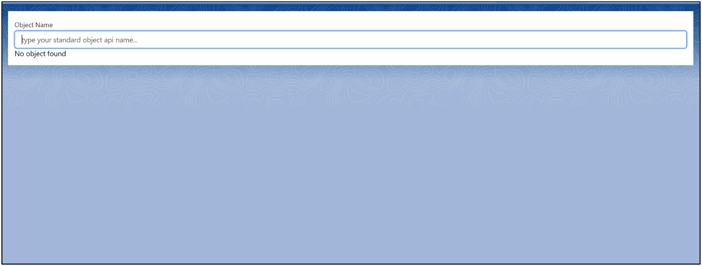
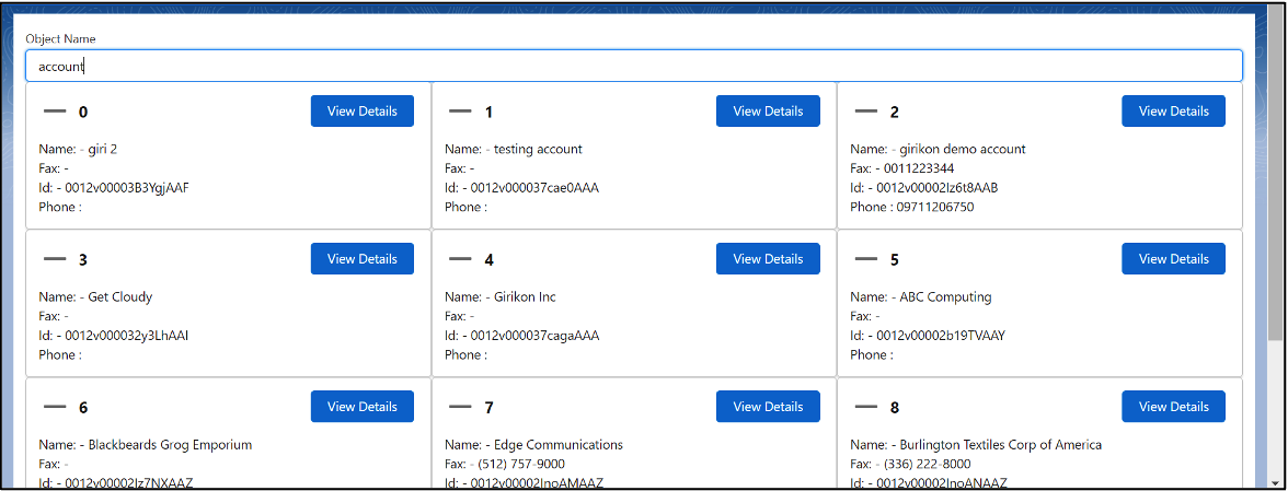
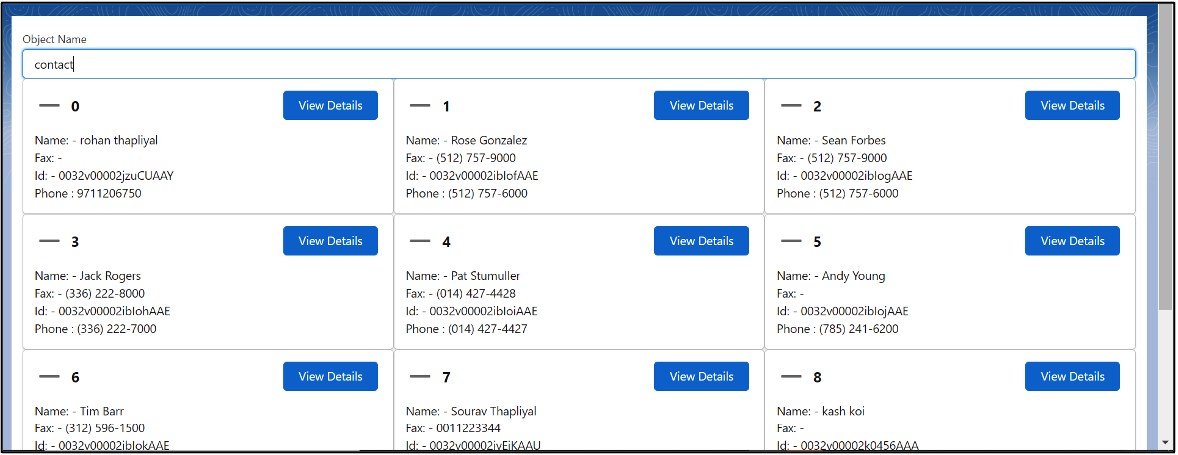
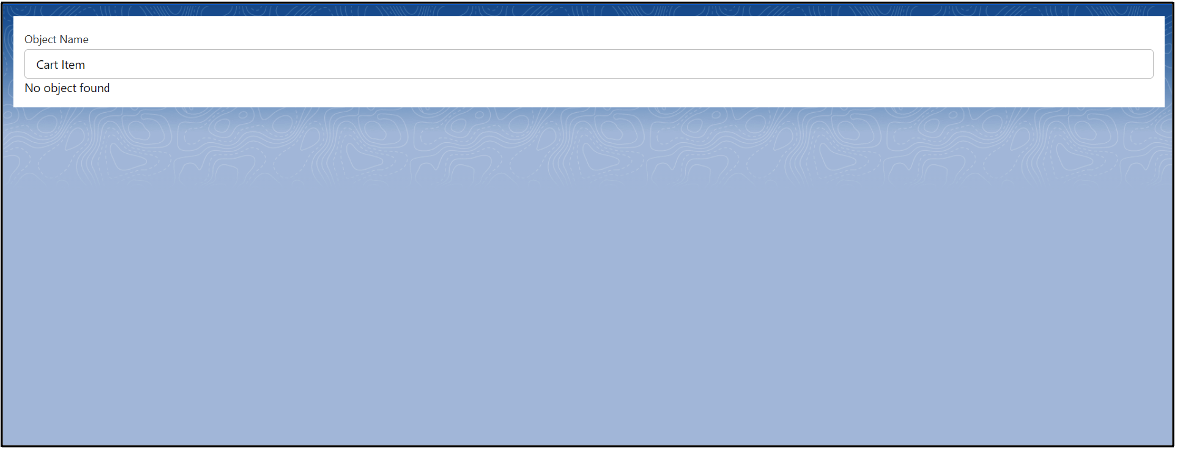
<lightning:input name=”objectName” value=”{! v.objectName }” placeholder=”type your standard object api name…” label=”Object Name” aura:id=”objectName” onchange=”{!c.onChange}”/>
{!v.Error}
<div class=”slds-grid slds-wrap”>
<!– aura iteraion –>
<aura:iteration items = “{!v.RecordList}” var=”item” indexVar=”varIndex”>
<div class=”slds-col slds-size_1-of-3″>
<!– lightning card –>
<lightning:card title=”{!varIndex}” variant=”Narrow” iconName=”utility:dash” >
<aura:set attribute = “actions”>
<lightning:button variant=”brand” label=”View Details” title=”Brand action” onclick=”{!c.viewDetails}” name=”{!item.Id}”/>
</aura:set>
<p class=”slds-p-horizontal_small”>
<!–div class=”slds-col slds-size_1-of-3″>
<img src=”{!$Resource.beerimg1}”/>
</div–>
<div class=”slds-col slds-size_2-of-3″>
Name: – {!item.Name}<br/>
Fax: – {!item.Fax}<br/>
Id: – {!item.Id} <br/>
Phone : {!item.Phone}
</div>
</p>
</lightning:card>
</div>
</aura:iteration>
</div>
</div>
</aura:component>
Notes:
- lightning:overlayLib: We have used an overlaylib tag of aura component. This tag is used to create or display messages/popovers in the current window via a dialog box. In this example, we will display a component to display the full record detail page in a modal.
- Lightning:card: This is used to display a group of information in a compact card layout.
GenericListCmpController.js:
({
viewDetails : function(component, event, helper)
{
var EventSource = event.getSource(); //any attribute of a tag can be fetched from this line of code.
var RecordID = EventSource.get(‘v.name’);
var Object = component.get(‘v.objectName’);
console.log(Object);
console.log(RecordID);
component.set(‘v.RecordId’,RecordID);
$A.createComponent(‘STGiri:GenericDetails’,
{
“RecordID” : RecordID,
“objectName” : Object,
},
function(GenericDetails, status, errorMessage)
{
if(status === ‘SUCCESS’)
{
//alert(“success”);
console.log(‘overLay ‘+component.find(‘overlay’));
component.find(‘overlay’).showCustomModal({
header: “Details”,
body: GenericDetails,
Footer: ‘Footer’,
showCloseButton: true,
closeCallback: function() {
}
})
}
else if(status === ‘ERROR’)
{
alert(‘error—->’+errorMessage);
}
})
},
onChange : function(component, event, helper)
{
var searchParam = component.find(‘objectName’).get(‘v.value’);
console.log(‘RecordList—> ‘+searchParam);
var action = component.get(‘c.objectSearch’); // calling the objectSearch apex Function
action.setParams({
objectName : searchParam
});
action.setCallback(this, function(response){
var state = response.getState();
if(state==’SUCCESS’)
{
var responseValue = response.getReturnValue();
if(responseValue != null)
{
console.log(responseValue);
component.set(“v.RecordList”,responseValue);
component.set(‘v.Error’,”);
}
else
{
component.set(‘v.Error’,’No object found’);
component.set(“v.RecordList”,null);
}
}
else if(state==’ERROR’)
{
alert(‘Error occured’);
}
});
$A.enqueueAction(action);
}
})
Notes:
- $A.createComponent: This is used to create a dynamic component on the run time. In the above example, we have used this to show the GenericDetails component. This component is used to display the full compact layout of the record. This function takes 3 parameters which are:
- componentName: Specify the component name that you want to be dynamically created.
- Parameters: Specify the list of attributes that you want to be initialized at the beginning or during the DOM.
- Callback Function: Specify the callback function. In other words, what you want the compiler to do when the control gets back. In the above example, we have used the Lightning:overlaylib here to show the record details in the modal box.
- getSource: This function is part of event handling of base lightning components. This is used to retrieve the component that fired the event. For standard HTML elements, we use event.currentTarget and event.Target, but for events fired by base lightning components we use Event,getsource instead.
GenericObjectListClass.apxc:
public class GenericObjectListCLass {
@AuraEnabled
public static List<sObject> objectSearch(String objectName)
{
try
{
String likeParam = objectName;
String Query;
if(objectName!=null)
{
Query = ‘Select Name, id, Phone,Fax From ‘+likeParam+’ limit 10′;
}
List<sObject> sObjectList = Database.query(Query);
if(!sObjectList.isEmpty())
return sObjectList;
else
return null;
}
catch(Exception e)
{
system.debug(‘exception–> ‘+e);
return null;
}
}
}
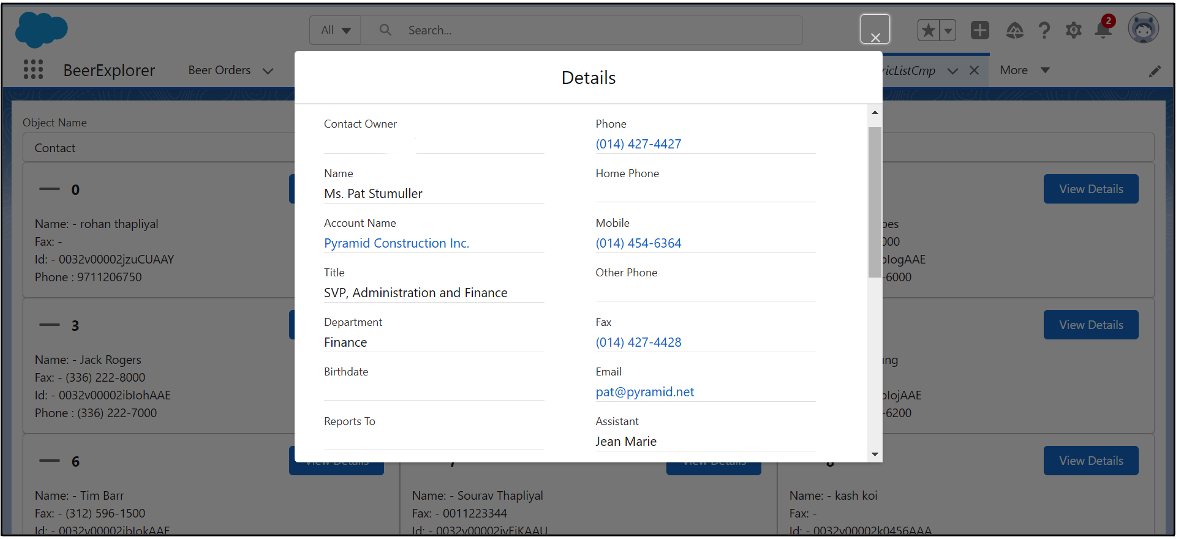
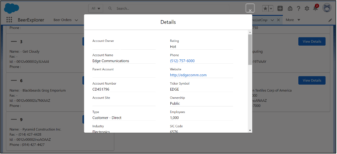
GenericDetails.cmp:
<aura:component >
<aura:attribute name=”RecordID” type=”String” />
<aura:attribute name=”objectName” type=”String” />
<div class=”slds-p-around_small”>
<lightning:recordForm
recordId=”{!v.RecordID}”
objectApiName=”{!v.objectName}”
layoutType=”Full”
columns = “2”
mode=”readonly” />
</div>
</aura:component>
Notes:
- Lightning:recordForm: In the above example, we have used lightning:recordForm. This is a part of lightning data service of Salesforce. Lightning data service is used to create, load, edit or delete a record in your component without the use of apex class. We have used this aura tag to load a full layout page in the read-only mode.
Visualizing the Components
Generic List Component:
Generic Details Component:
Additional Resources
- Salesforce Trailhead: Quick Start: Aura Components
- Salesforce Help: Which Components Can I Use with Each Aura Template?
Cover Photo by Chris Ried on Unsplash

