
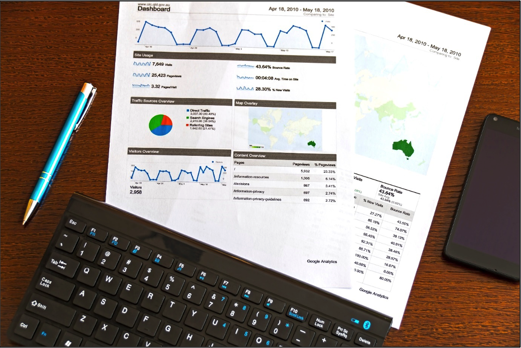
Just imagine that your manager asked you about the percentage of opportunities that had been closed this year. And after hundreds of clicks, you get frustrated. Thankfully, Salesforce reports and dashboards are able to make your life easier. Compare, evaluate, separate, categorize and visualize data that will help you and your team save time and make accurate business decisions. All with the power of Salesforce reports and dashboards, you could win your manager’s appreciation along with helping your organization to grow and achieve business goals.
Benefits of Reports and Dashboards
You and your sales team can benefit from reports and dashboards in the following ways:
Visibility into figures — Reports and dashboards give you access to important data insights, which can help stakeholders make better decisions.
Time savings — You don’t always have time to manually dig into all your project data to answer your manager’s questions. Reports will help you to save time and answer the hard questions asked by the management quickly.
Flexibility — With features like reports, you can pull the data from all your standard and custom objects and fields. Then, with the use of many powerful options for tailoring reports and dashboards, you can provide results to the specific needs of your end users and management.
Let’s practice some common actions for Reports and Dashboards together, by following along below to:
- Create Report and Dashboard folders
- Create a simple report
- Report filters & group your data
- Visualize your reported data
Create Report and Dashboard Folders
As we all know, folders can save you from unorganized files, and you can easily save time by grouping related items together in specific folders. Similarly, in Salesforce we have Report Folders as well.

Let’s create a Folder called North Sales Reports.
- Click the Reports tab.
- Then click New Folder and For Folder Label, enter North Sales Reports.
- Click in the Folder Unique Name box to auto-populate the unique name.
- Finally, click Save.
Similarly, you can create a Folder under Dashboards Tab. The best part here is that you can authorize specific people to view the Folders and the reports in them. To share a folder, follow the below process.
- Click Created by Me under Folders.
- Click the arrow Down icon to the right of the North Sales Dashboards/Reports folder and select Share from the menu.
- From the Share With dropdown, select with whom you wanted to share the dashboards/reports.
- In the Search Roles box, enter the team names you want to share with.
- Leave Access as View and click on Share.
Create a Simple Report
Before creating your first report, you should check the data access you have and to access all data you must associate the role of a CEO so that everything is visible to you.
Let’s create a summary report,
- Click New Report under the Reports tab.
- Under Choose Report Type list, click Opportunities and continue.
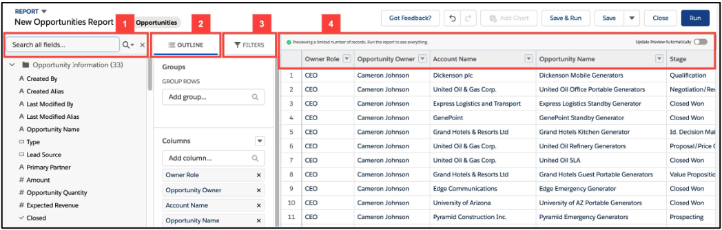
- The Fields pane (1) displays fields from the selected report type, organized by folder. Find the fields you want, then drag them into the Outline pane or double-click to add them to your report.
- The Outline pane (2) allows adding, removing, and arranging columns with just the drag-and-drop feature. You can also Bucket Columns and Summary Formula Columns in this pane.
- The Filters pane (3) lets you set the view, time, and filters to limit the data you want to show in the report.
- The Preview (4) offers a dynamic preview that allows you to customize your report. Add and remove columns, summary fields, formulas, groupings, etc. The preview shows only limited data. You’ll have to run the report to see all your results.
- To add a summary field, click the drop-down arrow icon next to any field. For example, Amount. Select Summarize and then click Sum. Now Save and Run.
Congratulations! You have created your first report!
Report Filters & Group Your Data
When creating the report, under the report builder interface, we have seen the Filters section. You will be excited to know that you can add up to 20 additional filters to a report directly and add logic using ‘and’ & ‘or’ operators. If somebody is looking for specific data, then you won’t hand over the full report. You will filter the report as per their needs.
- Filters like ‘Show Me’ is used to view specific data or all the data.
- Then ‘Created Date’ is used to filter the data as per the requirement. For example, if you only want to see this year/month/week’s data. You can filter that.
When we talk about grouping your data, it includes, using the Bucket fields. We can segment the data by defining sets of categories. It helps to filter the report by size or a certain type of category.
Visualize Your Reported Data
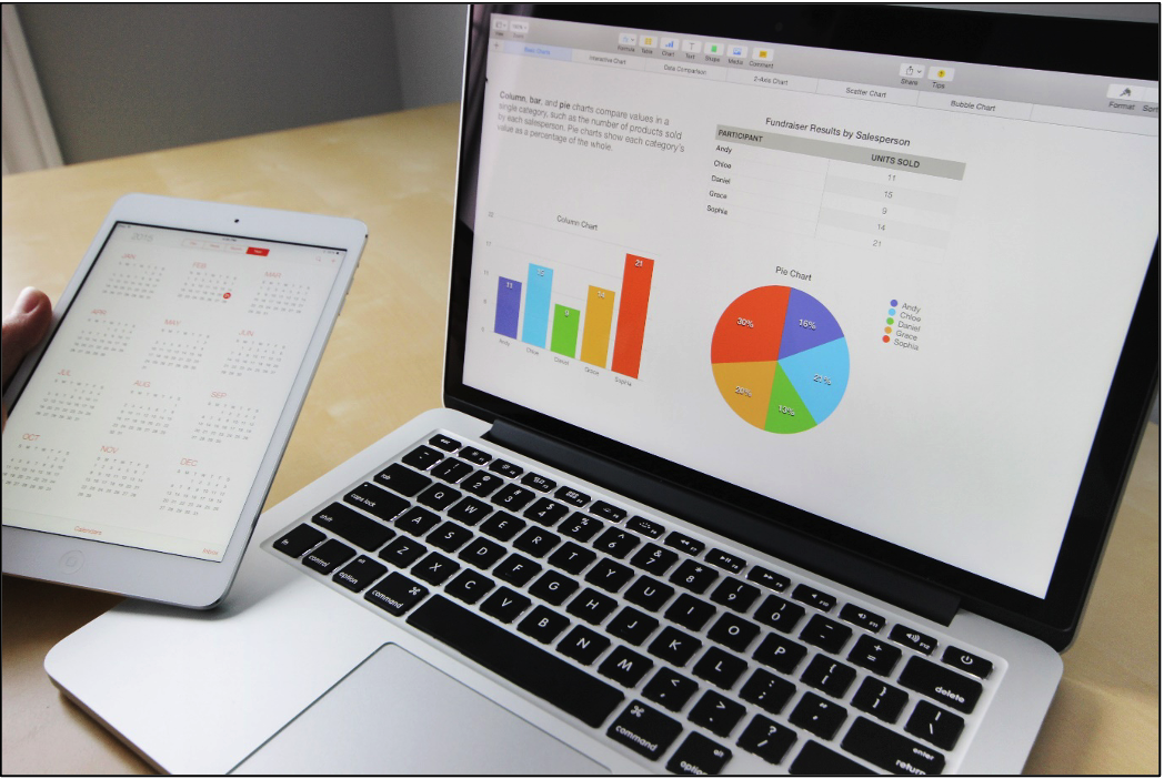
Doesn’t the pie chart and bar chart look beautiful and easy to understand in the below image? Yes, that’s why data visualization is so important. With the help of Salesforce dashboards, one can just use the existing report and create something wonderful and insightful like this.
We have 11 components under charts that will suit your needs for the data representation.
Such as lightning Table, Gauge, Metric, Vertical Bar Chart, etc. One can simply click on +component and in the search, type the name of your report and select. After doing some filters and changes we have our needed dashboard with the fields we are looking, for not all the data.
To learn more about how Salesforce can benefit your business, check out some of my other posts below!
Additional Resources
- Salesforce Help: Reports and Dashboards
- Trailhead by Salesforce: Introduction to Reports and Dashboards
- Gamechanger: Salesforce CPQ in the Sales Market
- Automate Customer Lifecycle with Salesforce CPQ
Cover Photo by Microsoft 365 on Unsplash